San Francisco New Year's Eve Timelapse

By . Updated on

San Francisco New Year's Eve Timelapse

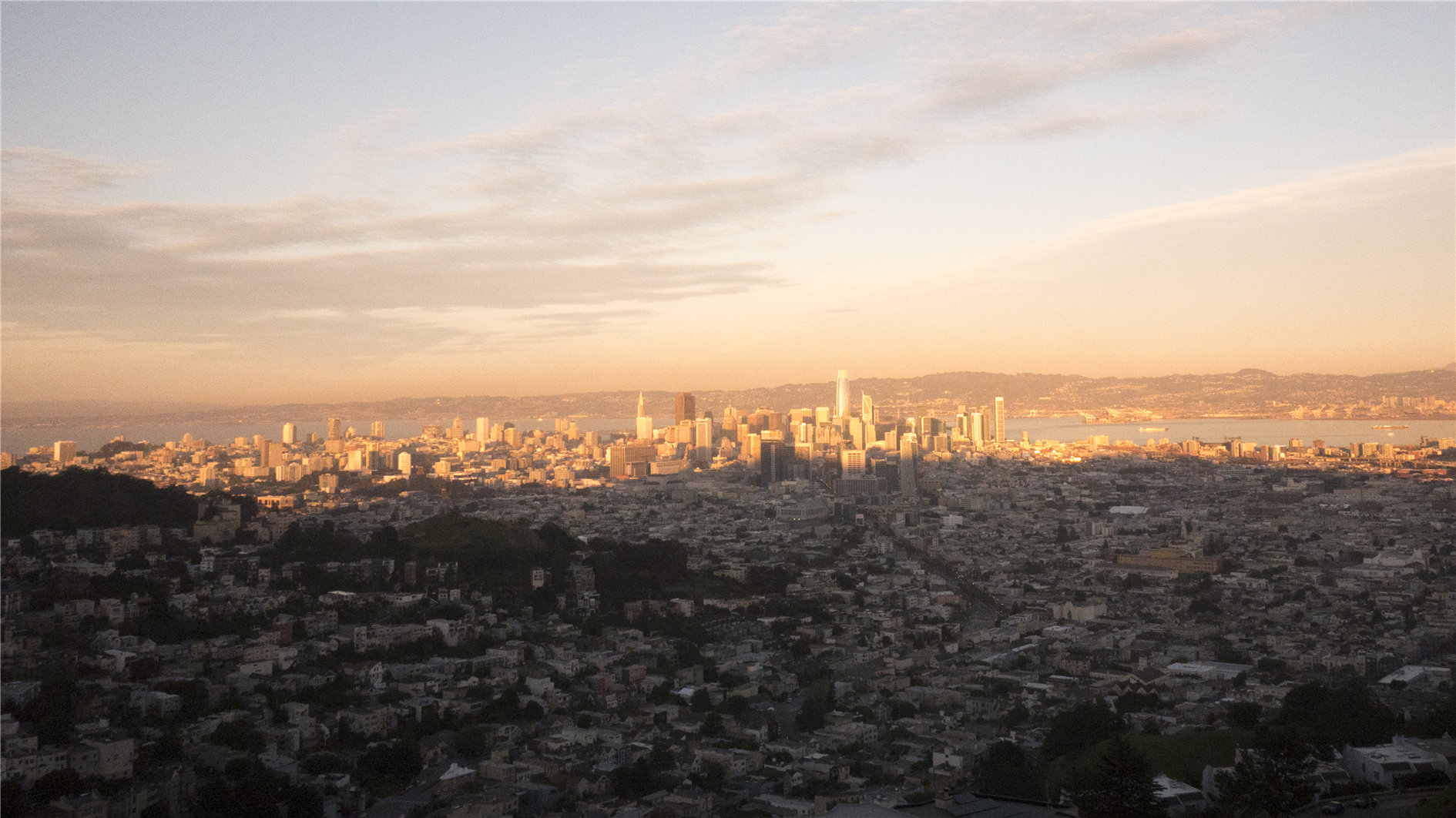
A timelapse portrait of San Francisco on New Year's Eve 2019:

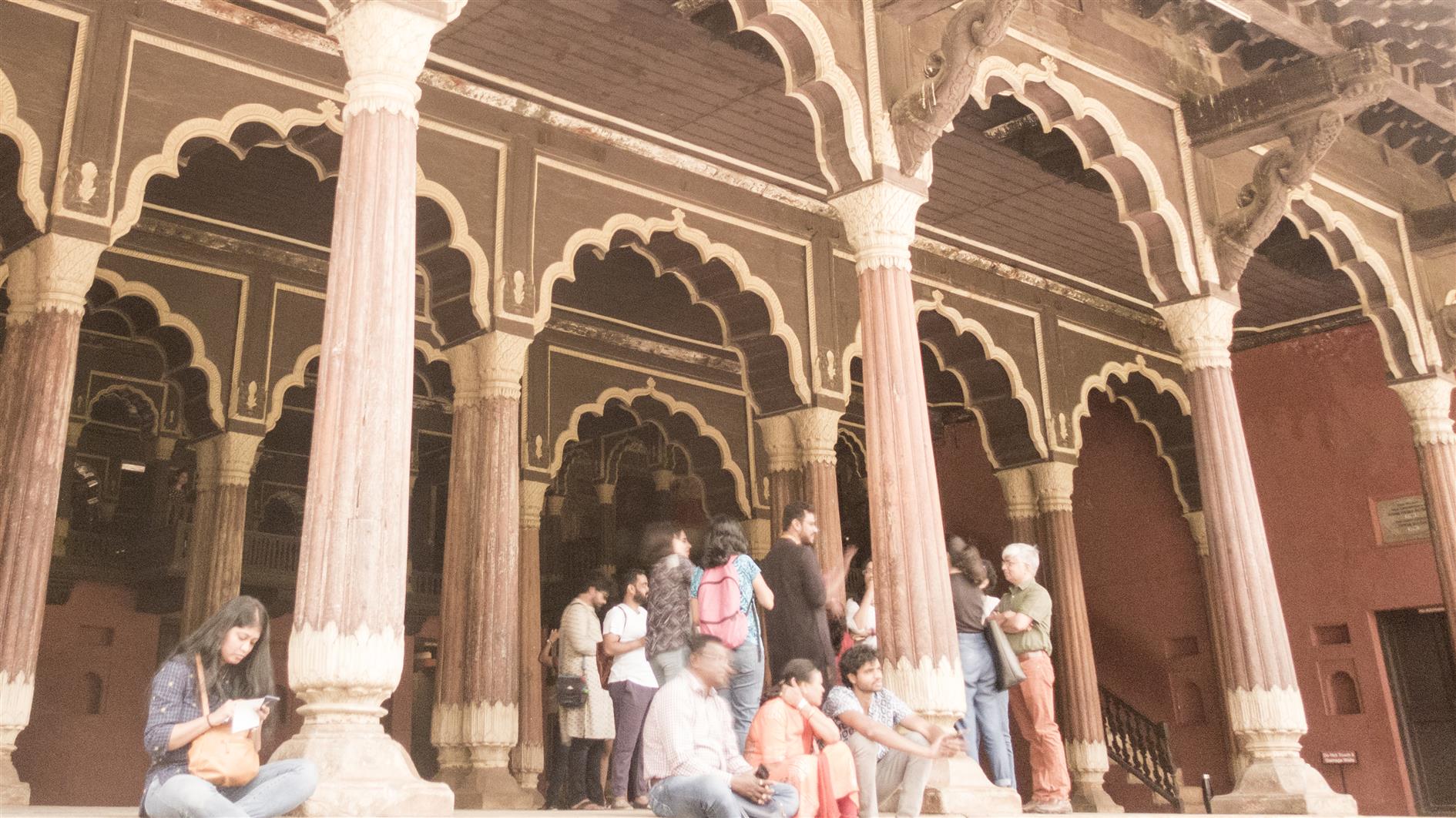
The video features the view from Inspiration Point, The Palace of Fine Arts, Union Square, Crissy Field, The Ferry Building, Music Concourse in Golden Gate Park, Market Street and the sun setting over downtown shot from Twin Pearks.

Road Trip Timelapse

By . Updated on

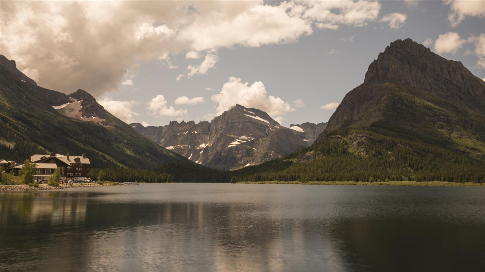
Swiftcurrent Lake at Glacier National Park

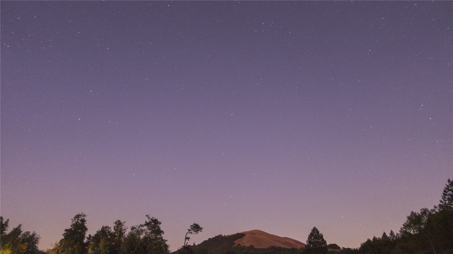
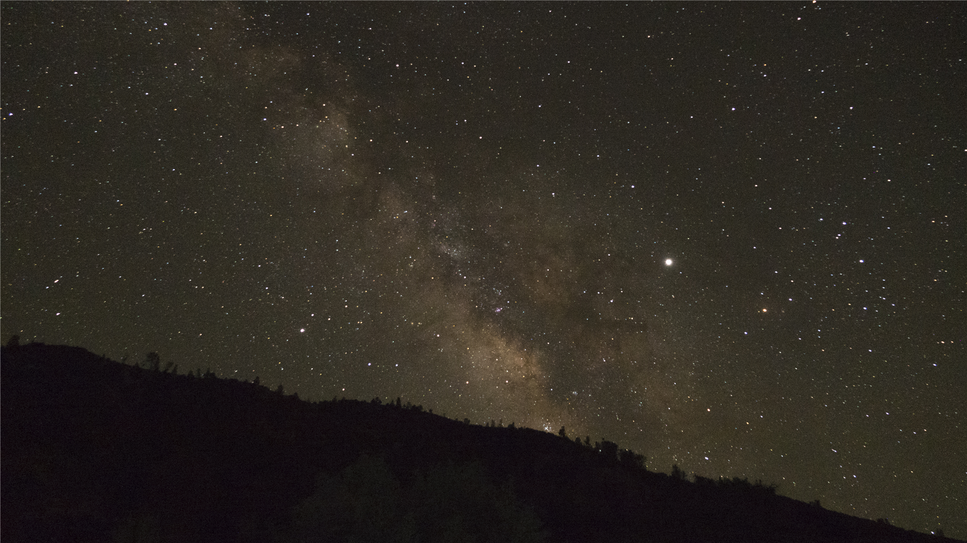
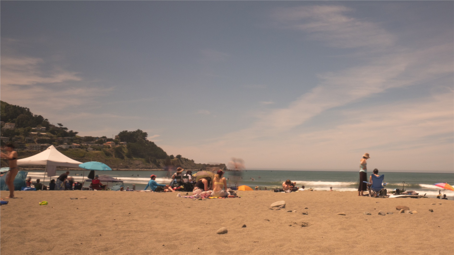
Compilation of time lapses from a recent toad trip - Grand Teton (with less than perfect focus), Yellowstone (Old Faithful), Yellowstone (Mammoth Hot Springs), Glacier (Swiftcurrent lake at the Many Glacier Area), Humboldt Redwoods State Park and then finally stars over Humboldt.

Game of Death

By . Updated on

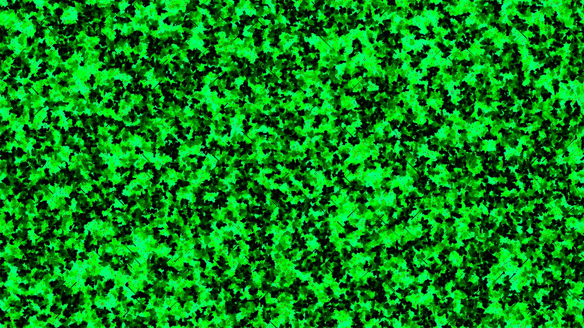
Generation 390

Conway's Game of Life, for 1,830 generations, starting from a random pattern. Instead of showing the live cells this animation focuses on death - each dead cell gets a little bit greener with each generation. You can just about make out a few static patterns in the darkness and the lines cruising through are left behind by gliders. Mostly though you're watching the horrible loss of life caused by cellular social isolation.

Golden Gate Bridge Timelapse

By . Updated on

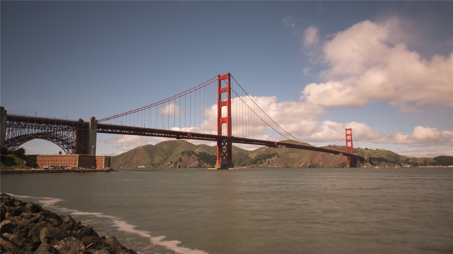
Golden Gate Bridge from near Fort Point

Shot from the Marin headlands, the Golden Gate Overlook and near Fort Point. I used an RX10 IV with an ND3.0 filter. Raw images were captured every four seconds with a one second exposure time. Edited with LRTimelapse and scored with Filmstro Pro.

I was expecting a pretty sunny day but ended up with regular showers and some pretty wild swings between sunshine and cold soggy overcast weather. I think the occasional raindrop and the mood swings work quite well, although the wind caused a bit of wobble on the long zoom onto the deck of the bridge.

(Previously)

Global Temperature Anomalies Animation, 1850 to 2018

By . Updated on

Global temperature maximum anomaly from Jan 2010 to Nov 2018

I made this animation to visualize climate change based on the HadCRUT 4 data (specifically the ensemble median gridded data) from the Met Office Hadley Centre.

HadCRUT 4 provides temperature anomalies in a five degree grid by month and year from January 1850 to November 2018 (as of this post). Anomaly here means deviation from the 1961-1990 average.

In the animation I wanted to capture the full timespan of the data but also show long term trends. Each frame is a month of data and each five degree grid of longitude and latitude is colored based on the maximum cumulative anomaly (positive or negative) for each decade. The range for color is 0 to +/- 20.85 degrees, red for warmer and blue for cooler. This means there is a reset at the start of each decade, the first few years are mostly random noise but by the end of each decade you're seeing the range of extremes.

Spoiler alert - you can spot something happening in the last three decades.

As well as the change in temperature it's interesting to watch the increase in global coverage over time. It's surprising that even the most recent years have no readings for Antarctica. Here's a paper (PDF) discussing the impact of the missing data. The HadCRUT 4 FAQ has more detail on how the temperature anomalies were assembled.

(Previously)